

Through The Liquid Glass
How Apple’s Liquid Glass is reshaping UI and what it means for icon design

It’s always nice being right.
A few weeks before WWDC I wrote about the upcoming colourful and dimensional shift in interface design.

That post ended up on the front page of Hacker News and was read 87,000 times.
And then Apple announced Liquid Glass.
People tend to push back on visual change. With Liquid Glass, it’s important to separate knee-jerk reactions from real critique. Contrast, legibility, noise—these are valid, fixable issues. And over the past few weeks, Apple has begun addressing them in the developer betas.
It’ll be interesting to see how much gets resolved before the public release in September. (Remember: it took iOS 7 more than three major versions to iron out early flat design issues.)
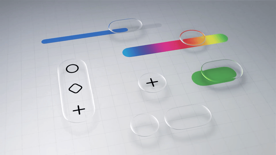
Glass has been part of interfaces for decades. Aqua had gloss. Aero had translucency and blur. Liquid Glass feels like something else. It bends light, moves with content, and brings depth in a new way. It might look like we’ve been here before, but we haven’t.


It’s easy to dismiss Liquid Glass if you’re only looking at the surface. But this shift has been a long time coming. We need dynamic, dimensional systems that scale across screens, platforms, and spatial environments.
Future interfaces aren’t static. They’re layered, content- and context-aware. Eventually gracefully morphing with the environment in a mixed reality world.
People who only see the light bending into a prism flare along a refractive edge will lament the frivolousness of such nonsense visual flair. These people do not see where we are heading and how computing surfaces will have to adapt. To them, Liquid Glass is discarded as a useless gimmick.
People who don’t understand how modern GPUs work, complain about performance.
These effects are GPU-accelerated, composited in real time, and built into the OS rendering stack. If the beta feels slow, buggy, or battery-hungry, it’s not because of the design. It’s because early betas run extra diagnostics, lack performance tuning, and don’t yet have optimized power management. This happens every year, and it always gets better.
This isn’t just a fresh coat of paint. It’s a foundational shift toward a multiplatform future—one that will eventually extend into the real world.
I encourage people to watch “Meet Liquid Glass” from WWDC. There’s thoughtful, joyful vision underneath.
Is it perfect? Absolutely not.
New things rarely are.
Is there engagement to be mined in hating anything new from Apple? Absolutely. Through the noise, we’re left with considering all the nuances of how this new future will impact the surfaces around us and the work that we do.
Glass App Icons
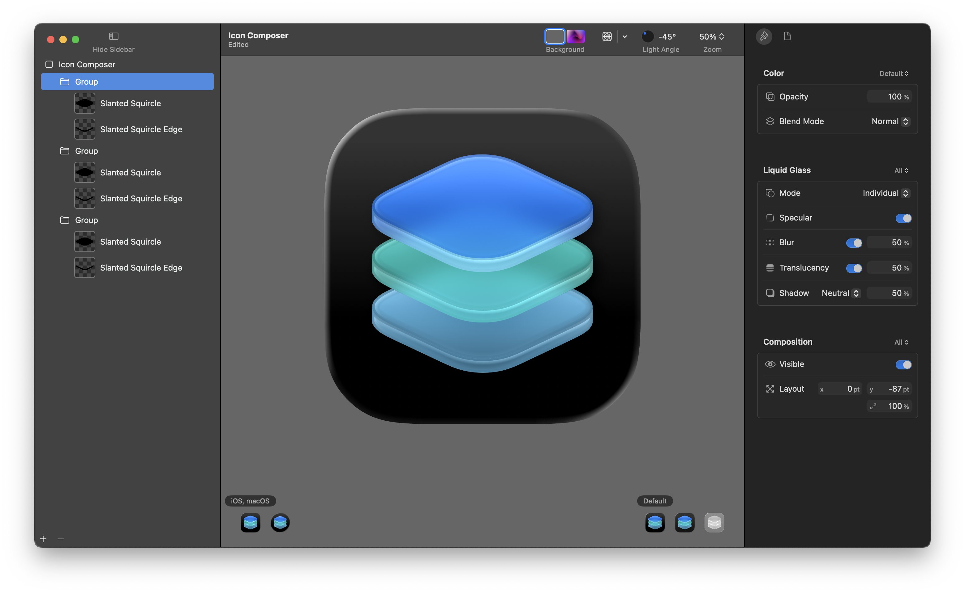
Liquid Glass is going to have huge implications for app icon design. It’s just one area of this new paradigm, but one that is very close to my heart. The glass treatment is automatically applied to all apps across all platforms. Using the new Icon Composer, you can control the effect on layers, except the base. Every icon will rest on a pane of glass.
With iOS, iPadOS, macOS, and watchOS 26, icons are now, for the first time, shared between platforms. Liquid Glass is attempting a unification of the design language across all of these platforms (but curiously not VisionOS).
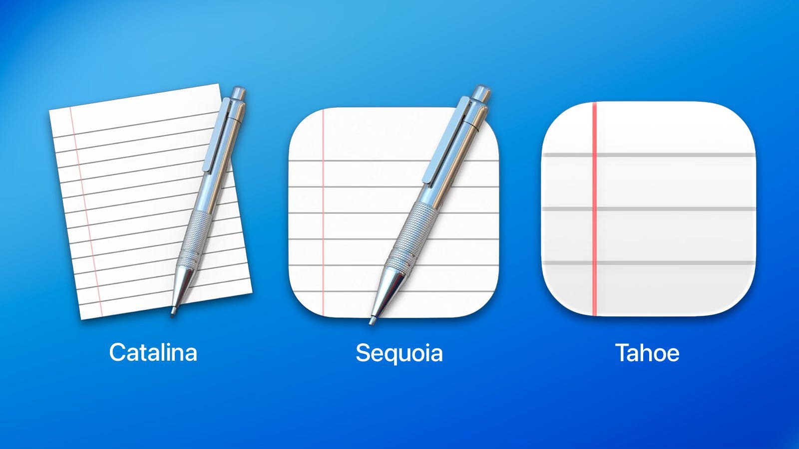
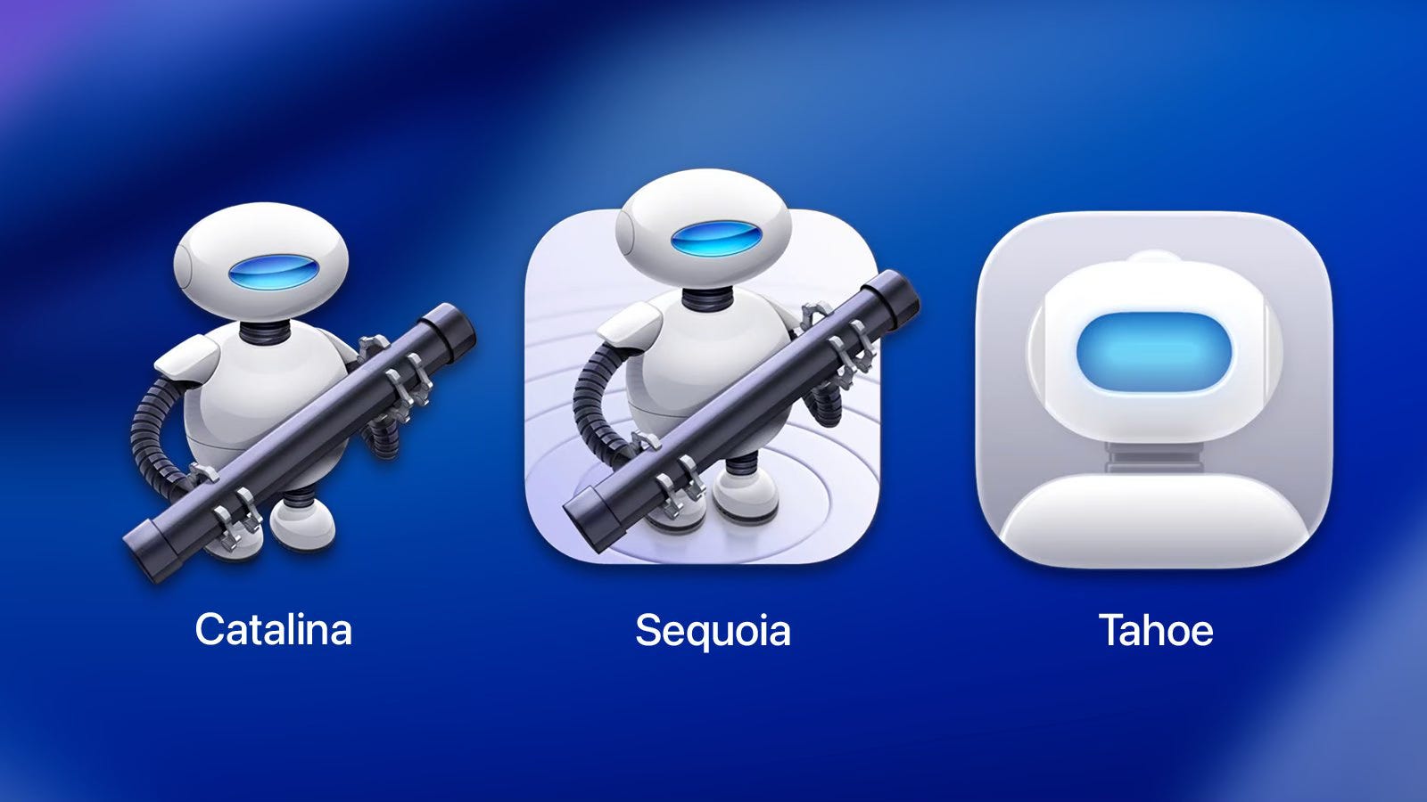
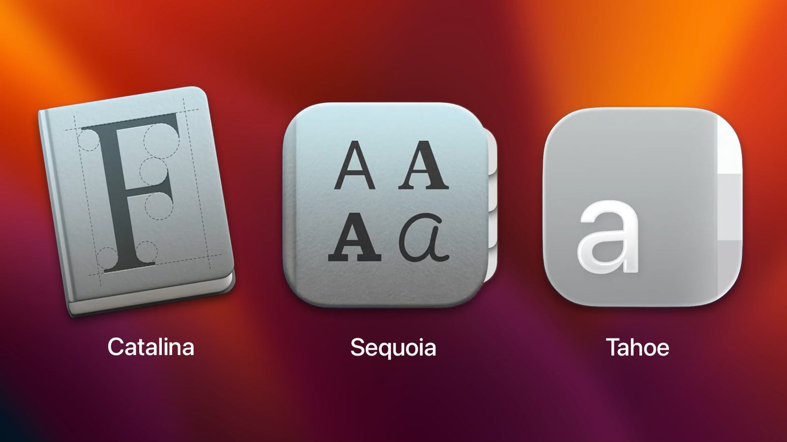
This also means that the Macintosh now shares the constraints of these other platforms. For the first time on the Mac, icons are imprisoned in Squircle Jail.
It ends a decades-long tradition of expressive, frame-breaking icon design, where transparency allowed for odd shapes, soft edges, and the occasional rebellious detail that reached beyond the grid. That era ends now.
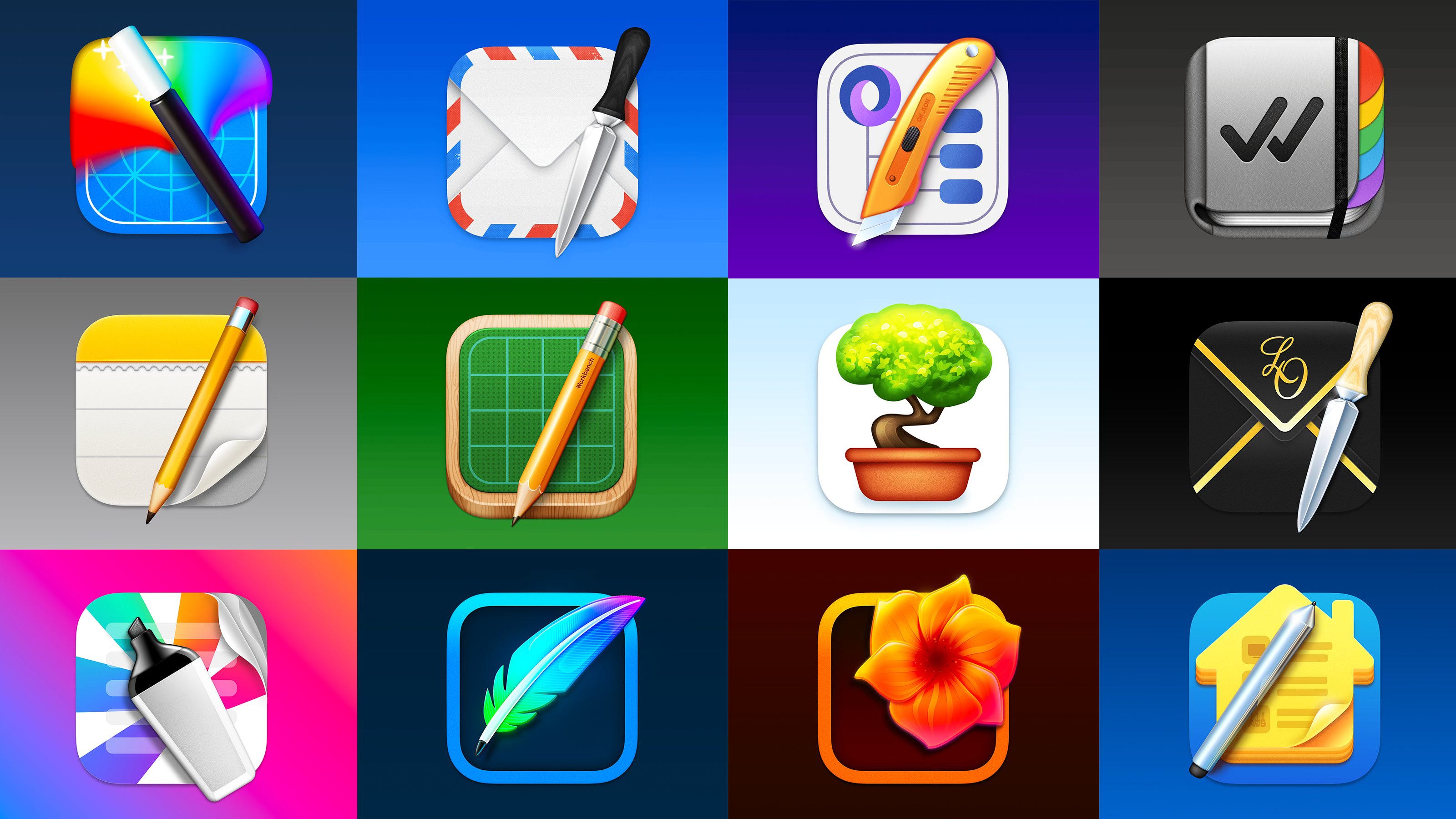
To add insult to injury, the new Tahoe icons are mostly a downgrade. They are less clear, not as well crafted and arbitrarily restricted.
With Liquid Glass, iOS gains personality and macOS loses some of its soul.
While I mourn the loss of transparency and unique app icon shapes on the desktop, I also fear that applying a single visual effect consistently across a big system is problematic.
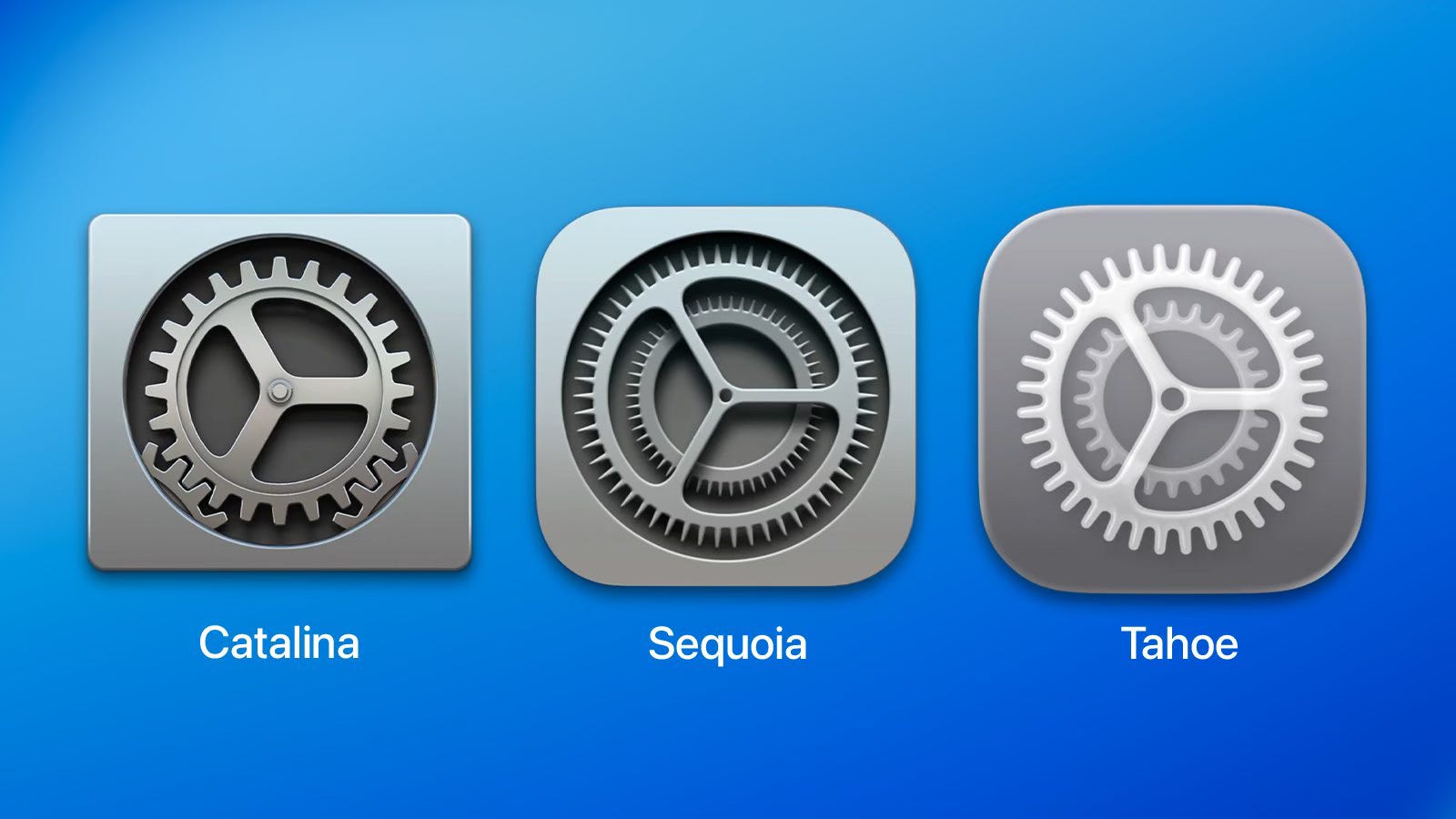
One of the reasons the new Tahoe icons can feel “blurry” is the uniform specular highlight applied across all layers. On lighter backgrounds, it reduces contrast and muddies detail.


In time, most of this can be fixed. But I have always seen the Macintosh as the bastion of great icon craftsmanship. It’s been driving a good chunk of my freelance career for 20 years and I wrote a book about it.
Now that heritage is being absorbed into a broader, unifying design language.
But design has always lived inside constraints.
It’s what we do with the canvas that matters.
There’s a certain aesthetic playfulness to Liquid Glass that is going to define this next era of visual design. And while I might disagree with some of the compromises they’ve had to make for it to span the platforms, I do celebrate the direction.
I’m excited for a more dynamic, tactile future of UI.
Let’s see what’s through the Liquid Glass.


Sponsor

The Playbook is a design newsletter written by Julien, a former amo, Snap & Zenly design lead. It mixes personal stories with hard-earned industry lessons, from craft to chaos, from product principles to taboo startup truths.
If you care about how great apps are built, and what really goes on behind the scenes, this is for you.
All readers from my newsletter get 1 free month of the upcoming exclusive content from the paid subscription (planned Q3 2025).
You too can sponsor this newsletter and get in front of thousands of designers, makers, and curious minds. → Learn more.
"With Liquid Glass, iOS gains personality and macOS loses some of its soul"...truer words haven't been spoken. I'm on a very weird point where I am excited about updating my iPhone to iOS26 but completely against the idea of updating my MacBook to macOS 26.
“This isn’t just a fresh coat of paint. It’s a foundational shift toward a multiplatform future—one that will eventually extend into the real world” Yes, multiplatform UX, just like Windows 8… and remember what did happen?