Everything is new with App Icons
The biggest change to app icons just dropped and I have a new tool ready.
Apple just introduced a bunch of new things we have to consider when making app icons: New sizes, native support for dark mode icons and a new user customisable tinted icon.
Particularly the new tinted icons have created a bit of controversy on design twitter. People are quick to judge, calling this new user personalisation a design abomination. My feed is full of designers up in arms with indignation.
I’ve always been a strong supporter of UI customization and I’m excited for this new era of OS-supported app icon alternates. Don’t get me wrong, I love icons and spend many hours on the ones I’m lucky to work on. But I want a future where users own the surfaces around them.
Personalization cannot be curated by the few. Let people play.
Instead of taste-making on what others do with their devices, we should rather celebrate that we just got two more deliverables to express ourselves. We can deliver cool looking dark mode alternates and I already have ideas on how variants could be optimised for tinting.
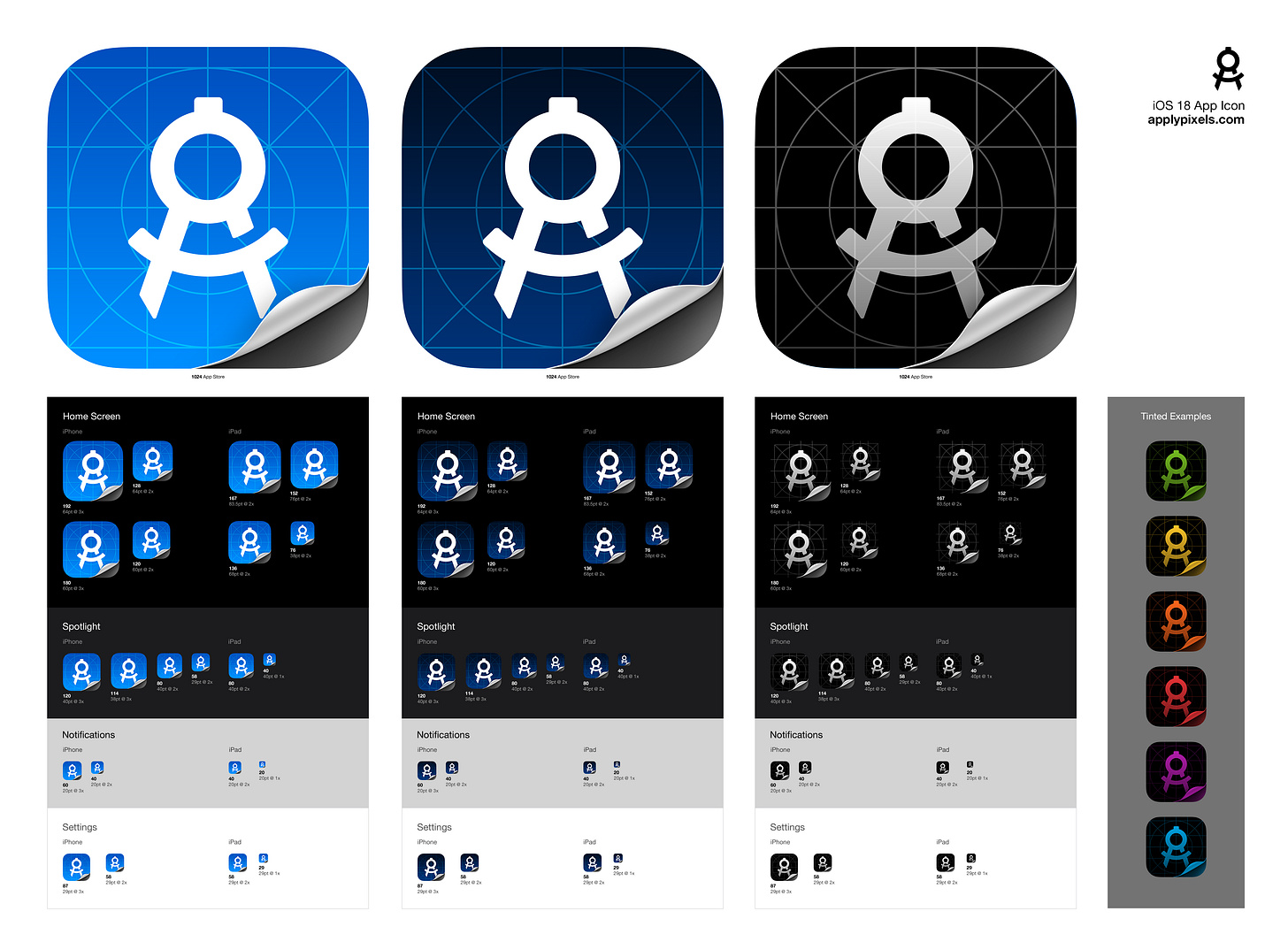
But, we need a new tool to support this so I just pushed out the biggest update to App Icon Template in 14 years. It now supports:
🌗 Light, dark, and tinted icon options
🎨 Tint & OS previews
🧰 Grids, Guides, Gradients & Folds
🪄 Auto-render all sizes
You can get the new template for Photoshop on Apply Pixels or Gumroad.
This took a complete rework of how this template works, but I'm really happy with how it now supports working on the 3 variants in the same document.
Each icon base has been extrapolated into linked .psb files, which also link to a separate OS-preview file, offering a much stronger workflow.
Tinting icons will be an interesting process, and we need proficient tools to approximate the appearance of our icons with this level of user customization.
Each .psb file is equipped with easy-to-use building blocks such as grids, guides, gradients, and folds for creating each type of icon.
Lastly, each of the three icons is automatically rendered into three separate folders with all the latest sizes, including the four new ones added in Xcode 14.
From now on, to take full advantage, every app icon will have to be submitted with their own dark and tinted variants and I’m here for it.


If you need help with a dark mode variant of your app icon, then don’t hesitate to get in touch.
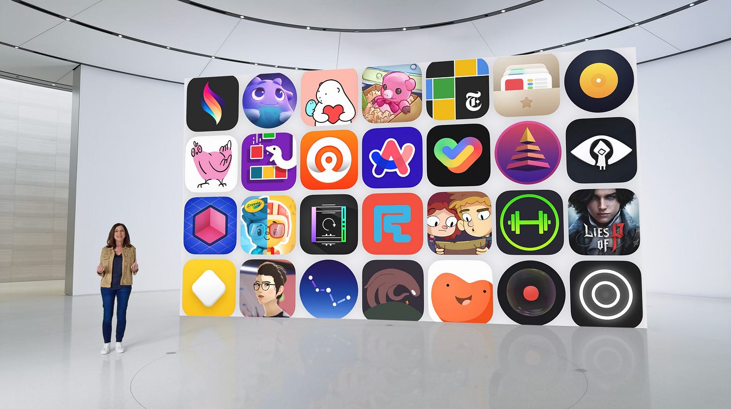
Oh, and this year also marked another WWDC with some of my art featured on stage. Incredibly proud to have worked on Apple Design Award winner OKO App.
I hope you have a great week.
Sincerely,
Michael


